Chapter 02, The mark
Logo
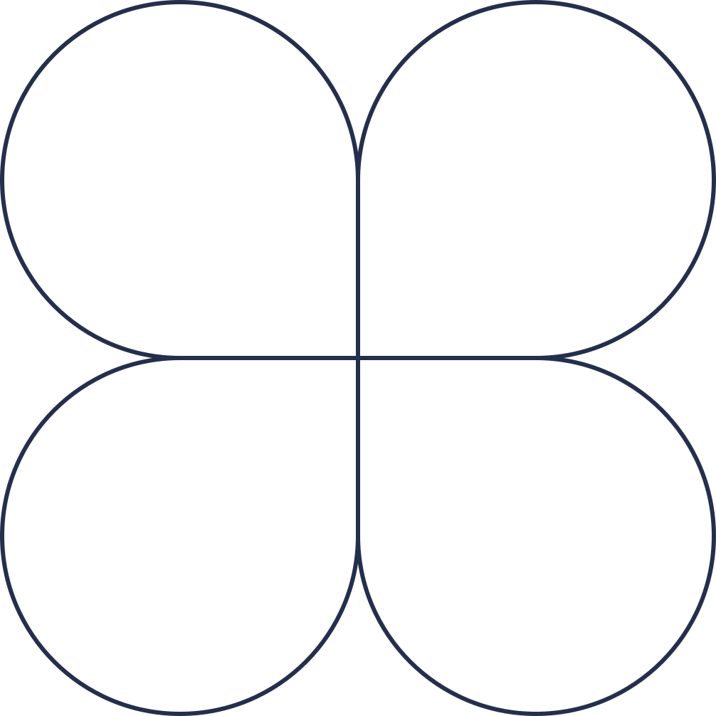
The primary mark leads everything. Give it room to breathe, clear space around it should equal the height of the inner dot.

The mark
Every variant as vector SVG, or transparent PNG in the exact pixel size you need.



Wordmarks
The full SENBEE lockup, for headers, documents and co-branding.



























































A few simple rules.
The mark works hard. Let it. Keep it clean, keep it recognizable, and it'll do its job everywhere.
✓
Give it space
Clear space equals the inner dot's height. More is always better.
✓
Mind the size
Never below 24 px on screen or 10 mm in print.
✓
Pick contrast
Dark mark on light. Light mark on dark. High contrast always.
✗
Don't recolor
Use only approved color variants. No custom palettes.
✗
Don't distort
Never stretch, squish, rotate, or skew the mark.
✗
Don't crowd
No drop shadows, glows, outlines, or background patterns behind the mark.